Target User
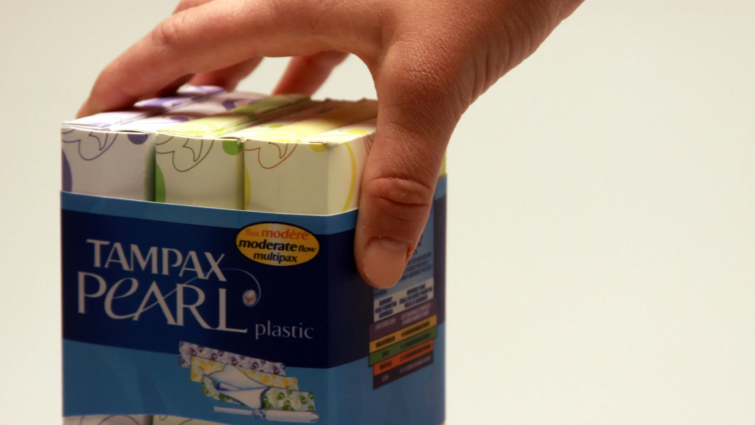
The Tampax Pearl brand is one of youth, reliability, and independence for the on-the-go woman. Tampax Pearl reaches out to younger tampon buyers so brand preferences lock in early and never change.
Ideation
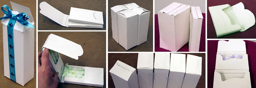
Different types of existing packaging were used as inspiration while ideating. Special attention was paid to slotting, openings/closures, and how intuitive different packages were. Gum, cigarettes, and candies are small packages that fit into purses/wallets.
Sketch Models
Building sketch models better enabled visualization of concepts.
How it Works
3 Sub packages can easily be stored in a purse, book bag, drawer of a desk at work, or suitcase on a business trip.
Stylish Accessory
When it is time to use a tampon, a woman does not need to stress out about awkwardly transporting her tampon to the restroom because she has her handy dandy “clutch”. Graphics on these three sub packages were abstracted from the design/pattern on the current tampon sleeves/wrappers. They are stylish, fun, and reflect the Tampax Pearl brand.
Devil in the Details
The graphics are slightly lighter on this top pod compared to the bottom pod in order to create some contrast so that the slot is easy and intuitive for consumers to see and use.
Relating to marketing, there are uplifting sayings that appear inside the packaging that can only be read when opened (some are slogans that Tampax Pearl currently use in their advertising). “Divas don’t take days off”, “Give mother nature the smackdown”, and “The most fashionable time of the month” are some of the phrases. These are meant to cheer up the consumer.
Adaptable Packaging
The bottom pod may be torn off and recycled when the five tampons in that pod are used. The remaining top pod, which has an extended tab and corresponding slot, then becomes its own unit (with five tampons).
Awards
WPO (World Packaging Organization) WorldStar Student 2011 International Packaging Design Competition - awarded the WorldStar Student Certificate of Merit & 11th place winner
Ameristar Student Packaging Competition 2011– 2nd place winner


